
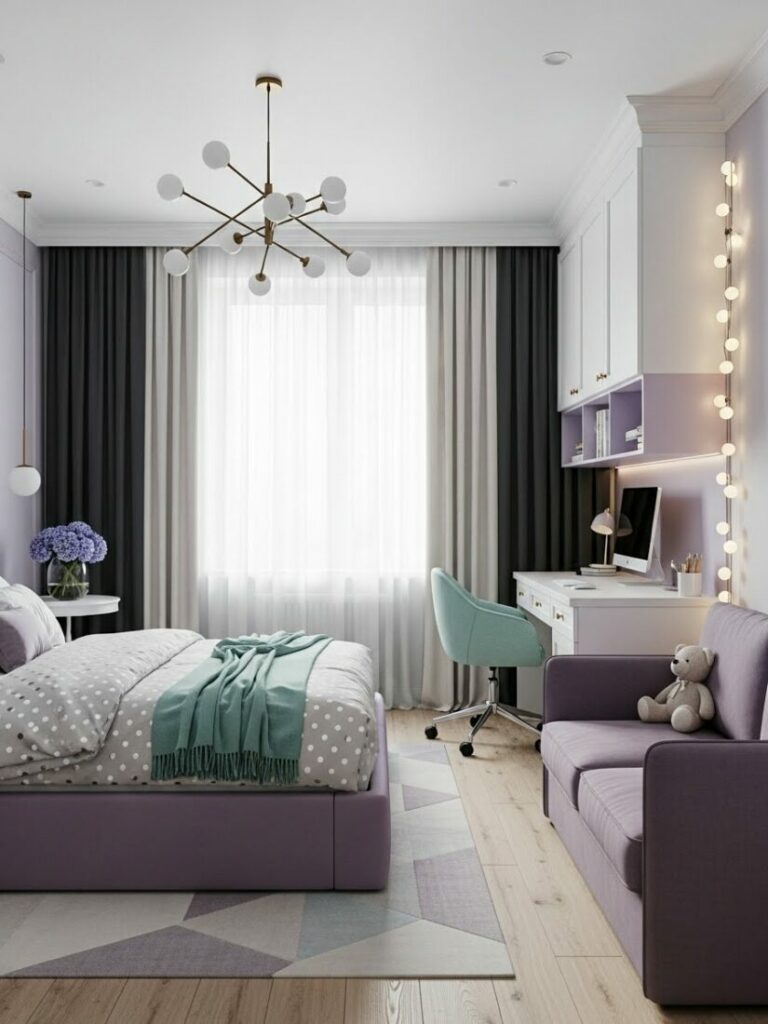
Dorm room color designs are the secret weapon for turning a sterile box into a home. Most students settle for the bland, institutional white walls provided by the college. You are not most students.
Your environment dictates your academic success. It influences your social life. It controls your sleep quality. Therefore, curating your space is essential.
This guide goes beyond basic posters. We will explore the psychology of hue. We will master the art of textile layering. We will teach you how to paint with light.
Every choice you make sends a signal to your brain. Let us ensure those signals are positive. Welcome to the masterclass of small space decorating.


Understanding the Psychology of Color
Before buying a single pillow, you must understand the mind. Color psychology is a real science. It affects your heart rate. It changes your cortisol levels.
Your dorm is a multi-functional space. It is a bedroom. It is a study hall. It is a living room. Consequently, your color choices must balance these competing needs.
Warm Color Tones:
Colors like red, orange, and yellow are stimulants. They mimic the sun. They energize the body. They encourage conversation and activity.
However, they can be dangerous in small rooms. Too much red can induce anxiety. It can make it hard to wind down after a long lecture.
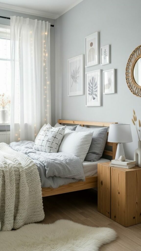
Cool Color Tones:
Colors like blue, green, and purple are sedatives. They mimic the ocean and the forest. They lower blood pressure. They promote deep sleep.
Yet, they have a downside. Too much cool color can feel cold. It can feel melancholy during winter months. Balance is the key.
Expert interior design for students relies on the 60-30-10 rule. This formula saves you from chaos. It ensures your room feels cohesive.
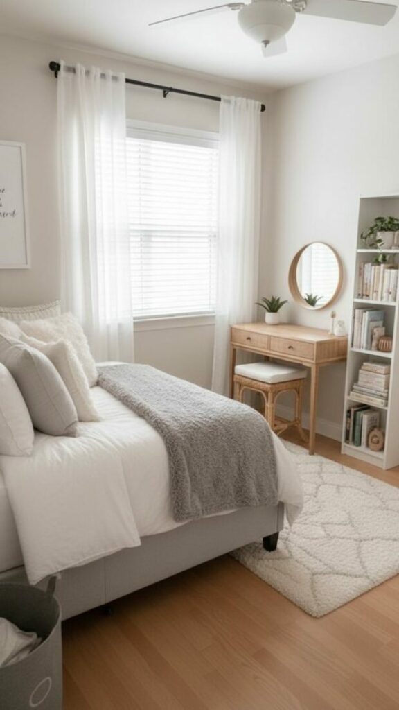
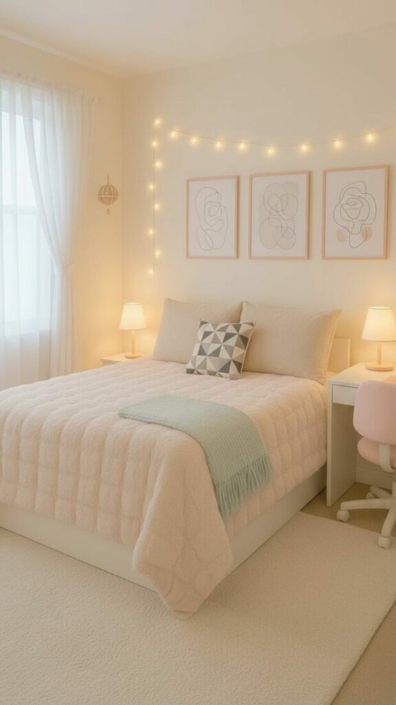
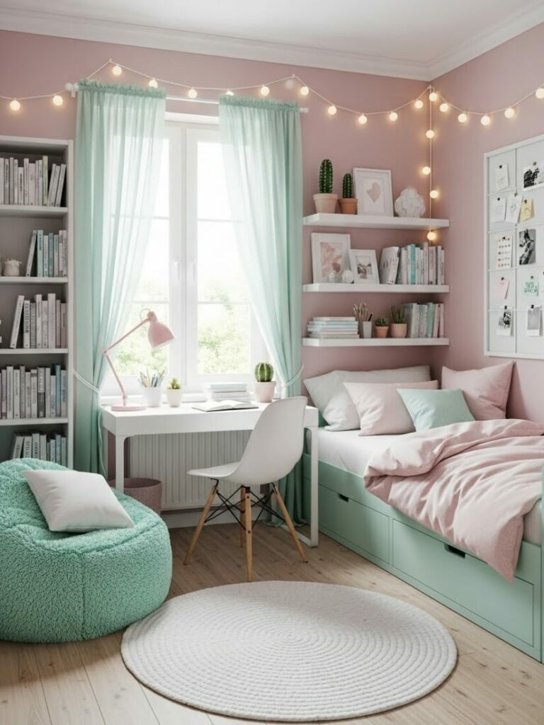
Palette 1: The Matcha Latte Minimalist
This is for the student who needs a mental detox. College is stressful. Your room should be the antidote. Think of a quiet zen garden.
The Core Colors:
- Sage Green: This is your primary hue. It represents nature.
- Oatmeal Cream: A soft, warm neutral. Avoid stark white.
- Natural Bamboo: Wood tones ground the space.
- Slate Grey: Use this for small accents only.
How to Execute It:
Start with the bed. Choose a duvet cover in washed linen. The texture should look lived-in. Sage green bedding creates an immediate focal point.
Furthermore, add plants. Real plants are best. They clean the air. Pothos and Snake Plants are nearly impossible to kill. Their chlorophyll green adds vibrancy.
For the floor, use a jute rug. This adds an organic texture. It feels rough but grounding underfoot. This palette promotes focus and tranquility.
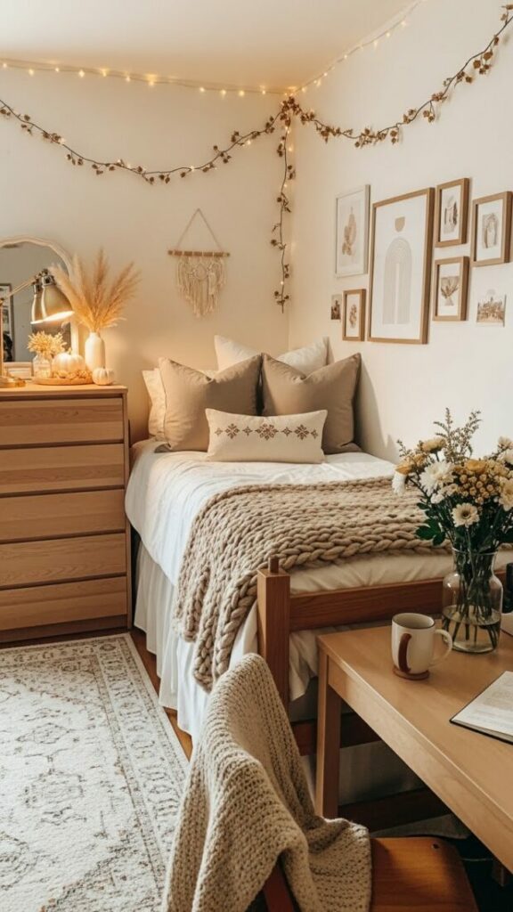
Palette 2: The Golden Hour Nostalgia
This aesthetic is for the creative soul. It captures the feeling of a sunset. It is warm, retro, and inviting. It feels like a 1970s film.
The Core Colors:
- Burnt Sienna (Terracotta): The color of baked earth.
- Mustard Yellow: A muted, spicy gold.
- Faded Denim: A soft, vintage blue.
- Warm Sand: The balancing neutral.
How to Execute It:
Focus on corduroy textures. A mustard yellow corduroy pillow adds instant retro vibes. It is soft to the touch. It catches the light beautifully.
Lighting is crucial here. Do not use white light. Use warm, amber bulbs. Sunset projection lamps are perfect for this theme. They paint your walls in gradients.
In addition, look for amber glass decor. A small vase or a candle holder in orange glass glows when lit. It creates a “golden hour” effect permanently.
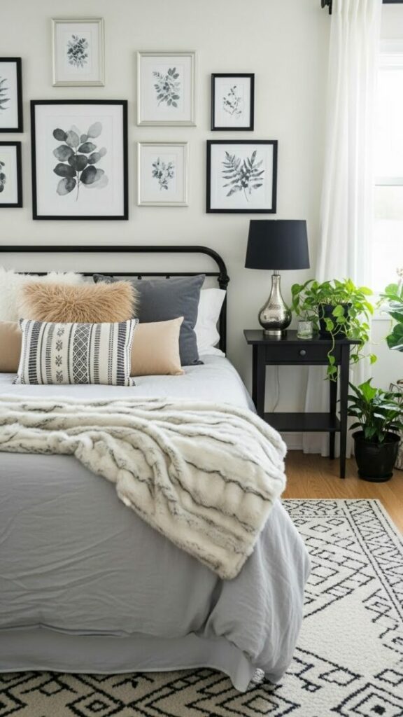
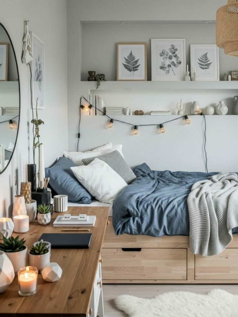
Palette 3: The Midnight Library
This is the Dark Academia look. It is for the night owl. It is for the serious scholar. It feels like a rainy day in London.
The Core Colors:
- Deep Navy: The color of the night sky.
- Espresso Brown: Dark wood and leather tones.
- Forest Green: A rich, intellectual hue.
- Antique Brass: The metallic accent.
How to Execute It:
Many students fear dark colors. They think it shrinks the room. However, dark colors blur the edges. They create a cozy, infinite cocoon.
Use velvet. A navy velvet duvet reflects light in a moody way. It feels luxurious. It adds a sense of history to a boring dorm.
Accessorize with leather. A faux leather desk chair or ottoman adds warmth. The brown leather contrasts beautifully with the cool navy. It looks sophisticated.
Dorm room color designs like this require warm lighting. Use a brass desk lamp. The gold metal warms up the cool blue tones.
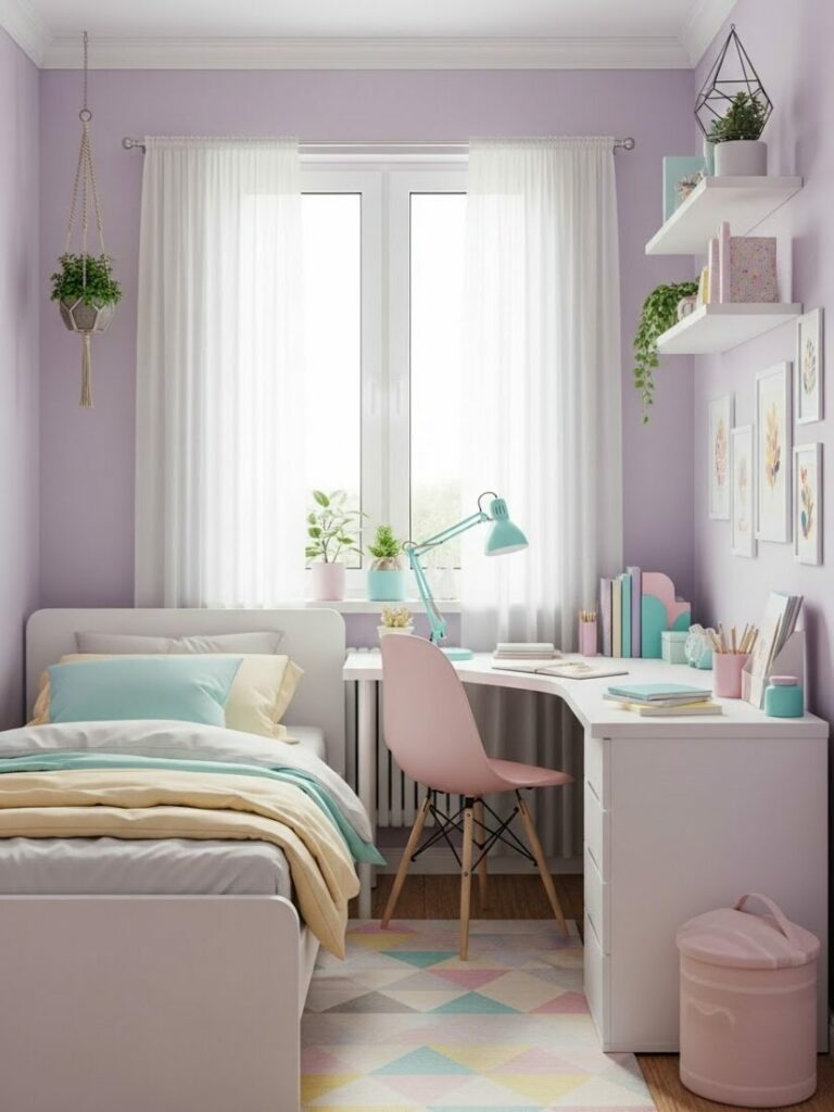
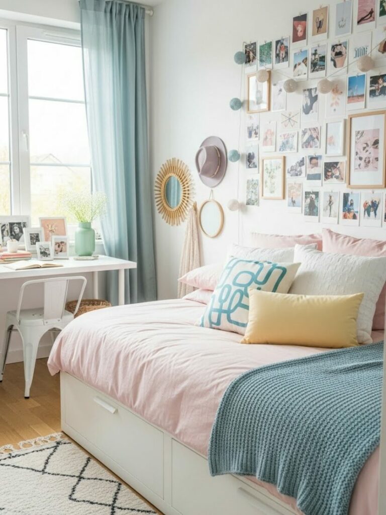
Palette 4: The Dopamine Pop
This is for the high-energy student. It rejects beige. It embraces chaos. It is playful, unserious, and stimulates the creative brain.
The Core Colors:
- Electric Lilac: A digital, modern purple.
- Kelly Green: A bold, grassy hue.
- Hot Pink: For emotional warmth.
- Black and White Checkers: The graphic anchor.
How to Execute It:
You must use patterns. Mix a floral duvet with a checkered rug. The black and white checkers act as a neutral. They ground the bright colors.
Use neon acrylics. Storage bins in transparent neon pink or green glow in the sunlight. They turn your clutter into modern art.
This style relies on high contrast. It keeps your eyes moving. It prevents boredom. It is perfect for art majors or fashion students.
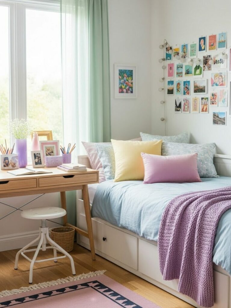
How to Choose Your Perfect Palette
Choosing is hard. You might like all of these. To decide, you must analyze your lifestyle. You must be honest with yourself.
1. Assess Your Stress Levels:
Are you easily anxious? Do you get overwhelmed by exams? If so, avoid the Dopamine Pop. It provides too much stimulation. Choose the Matcha Minimalist.
2. Analyze Your Lighting:
Does your window face north? North-facing rooms have cool, blue light. Warm colors like terracotta will look muddy here. Stick to cool blues or greens.
Does your window face south? South-facing rooms have warm, golden light. Almost any color works here. However, cool tones balance the heat nicely.
3. Check Your Furniture:
Most dorms come with honey-oak furniture. This wood is very orange. If you pick a cool grey palette, it will clash. The wood will look more orange.
Instead, embrace the warmth. Use warm creams or greens. These colors harmonize with the wood. They make the furniture look intentional.
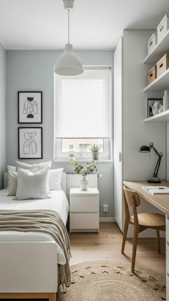
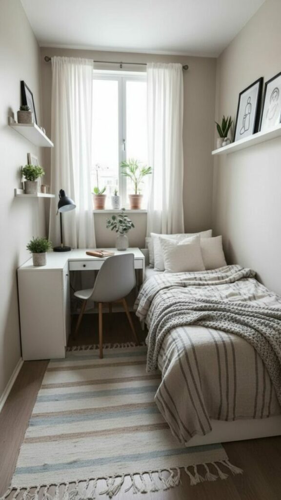
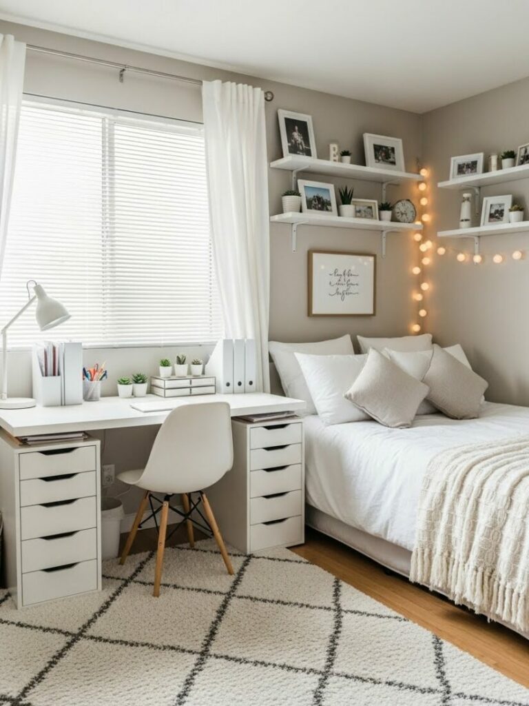
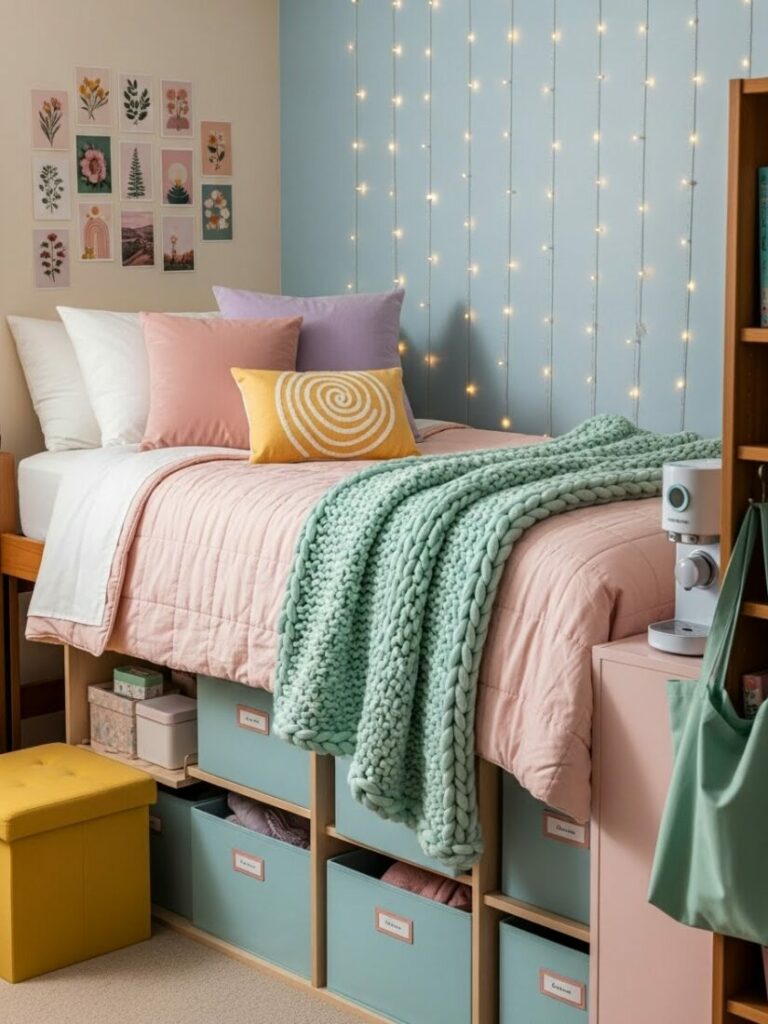
The Magic of Textile Layering
You cannot paint the walls. We know this. Therefore, fabric becomes your paint. Fabric covers the largest surface areas in the room.
The Bed is the Wall:
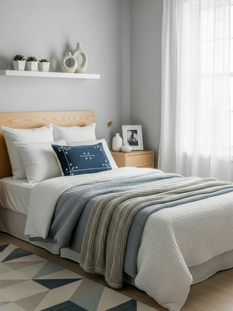
Your bed takes up 50% of the room visually. The color of your bedding is the dominant color of the room. Choose wisely.
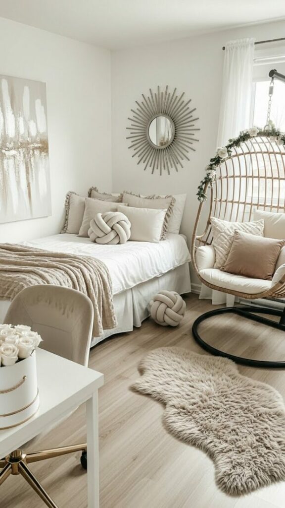
Do not use a flat, polyester sheet. It looks cheap. Use texture. A waffle-knit blanket adds shadows. These shadows create depth.
Layer a throw blanket at the foot of the bed. It should be a different texture. If your duvet is linen, make the throw velvet or faux fur.
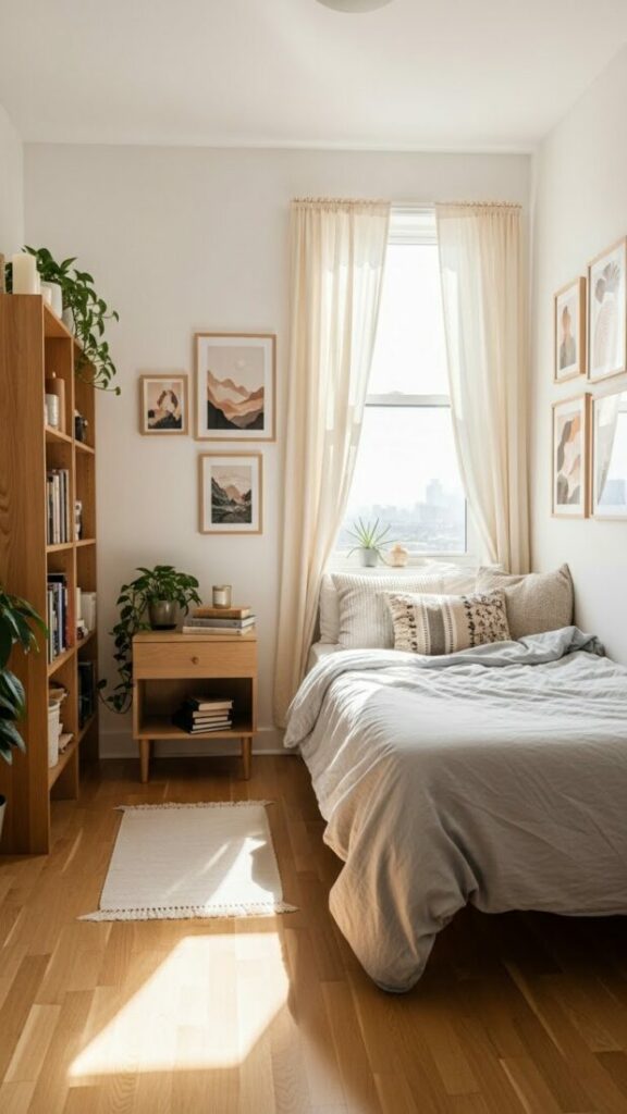
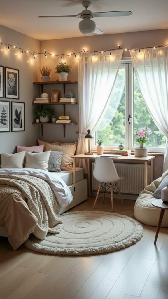
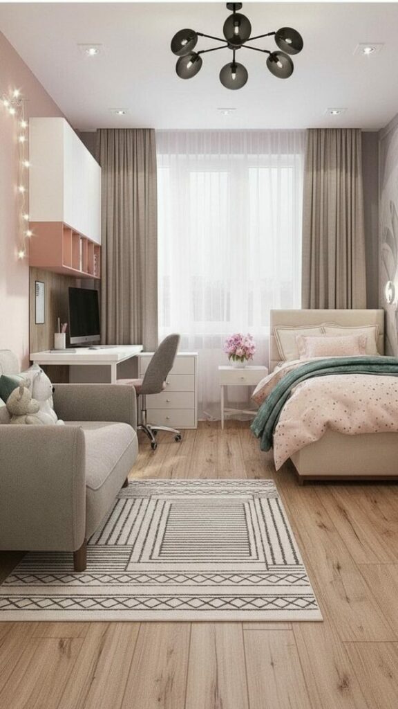
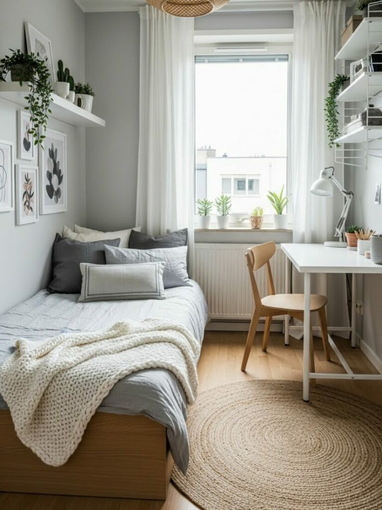
Curtains Change Everything:
Dorms usually have cheap plastic blinds. They are ugly. Hang curtains over them using a tension rod. No drilling is required.
Hang the rod as high as possible. This draws the eye up. It makes the ceiling feel taller. Choose floor-length curtains for drama.
If your room is small, match the curtain color to the walls (white or cream). This expands the space. If you want cozy vibes, match them to your bedding.
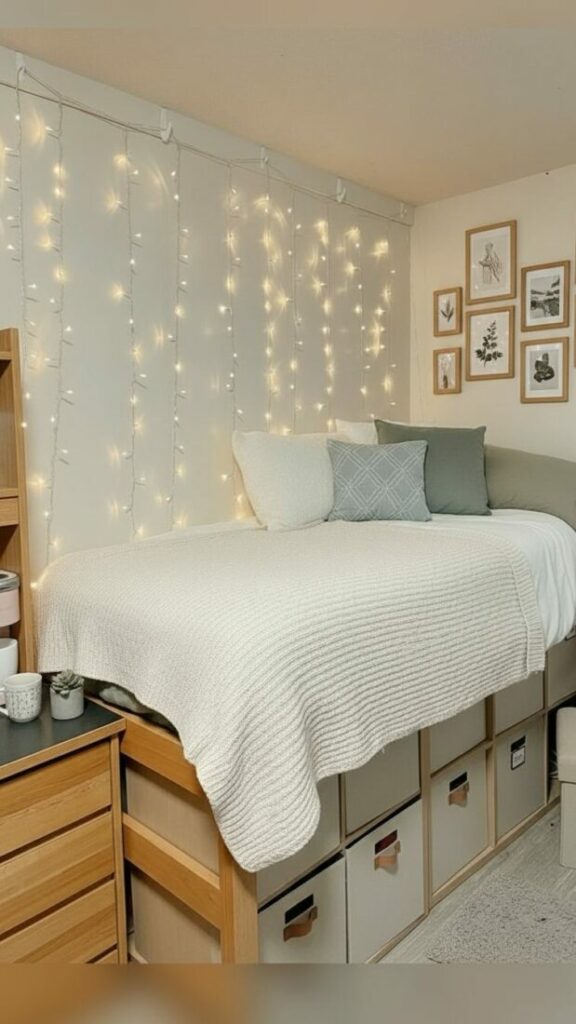
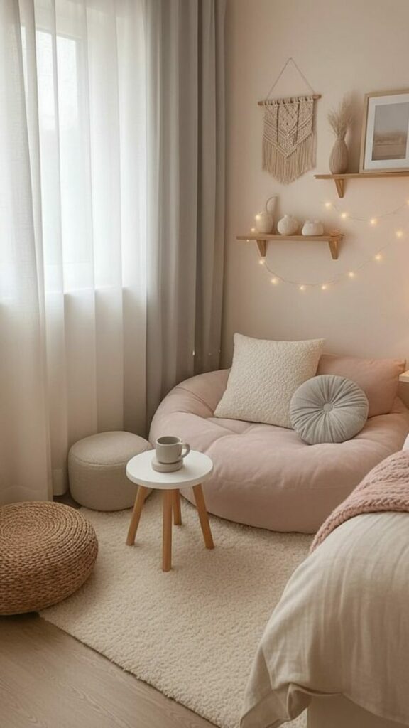
Lighting: The Invisible Paintbrush
Lighting is the most underrated element of dorm room color designs. The overhead fluorescent light is your enemy. It washes out color.
You must never turn on the “Big Light.” Instead, create pockets of light. This is called ambient lighting.
The Kelvin Scale:
Light has temperature. It is measured in Kelvins. Cool light (5000K) is blue. It is for hospitals. Avoid it.
Warm light (2700K) is yellow. It is for relaxing. It makes your skin look better. It makes your room feel like a home.
Smart Bulbs are Essential:
Invest in color-changing LED bulbs. They allow you to paint your walls instantly. For studying, set them to bright white. For movies, set them to deep purple.
LED strips can be tacky if visible. Hide them behind your headboard. Hide them under your desk. They should cast a glow, not show the diode.
Rug Sizing and Floor Coverage
The floor is usually cold tile. It is acoustically harsh. It echoes. A rug solves both sound and color problems.
Do not buy a small 3×5 rug. It looks like a postage stamp. It makes the room look smaller. It floats in the middle of nowhere.
You need a 5×7 or 6×9 rug. It should anchor the furniture. The front legs of your bed should sit on the rug. This connects the room.
If you choose a patterned rug, keep your bedding solid. If you choose a solid rug, you can go wild with bedding patterns. Contrast is necessary.
Wall Decor: Building an Accent Wall
Accent wall alternatives are vital for students. You cannot use wallpaper paste. However, you have other options.
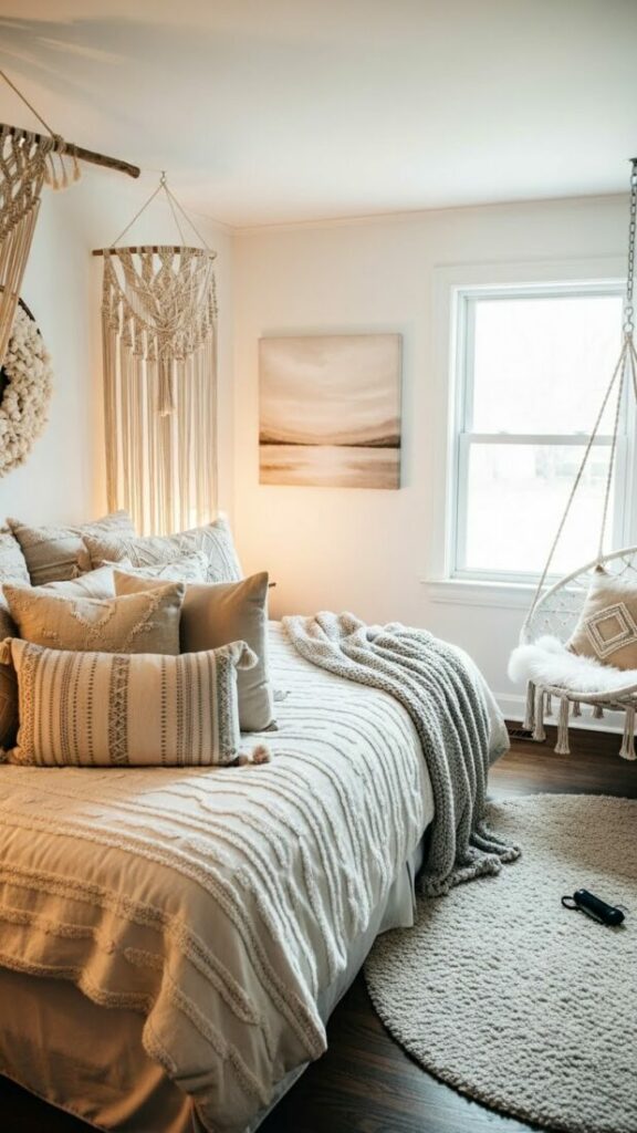
The Tapestry Hack:
Tapestries often look messy. They sag. To fix this, pull them tight. Use Command strips on all four corners. Use them in the middle too.
When tight, a tapestry looks like wallpaper. Choose a design that mimics a mural. Avoid simple tie-dye unless that is your specific vibe.
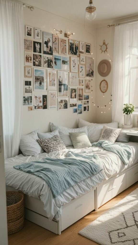
The Gallery Wall:
Curate your posters by color. Do not just hang random images. If your palette is Matcha, only hang images with green and cream tones.
Group them together tightly. A grid of 12 images looks like one large piece of art. This reduces visual clutter. It looks expensive.
Washi Tape Art:
Washi tape is Japanese rice paper tape. It comes in all colors. It removes easily without damaging paint. You can create geometric murals.
Create a faux headboard design behind your bed. Outline a city skyline. It is cheap, temporary, and incredibly creative.
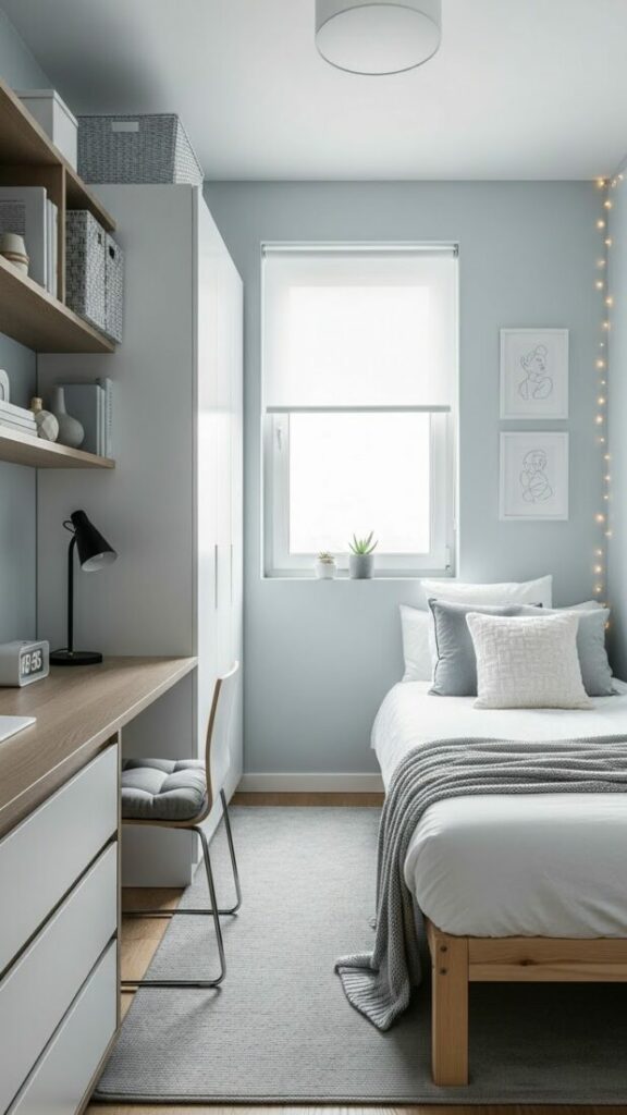
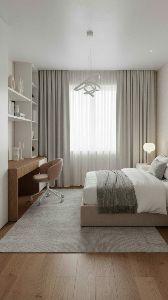
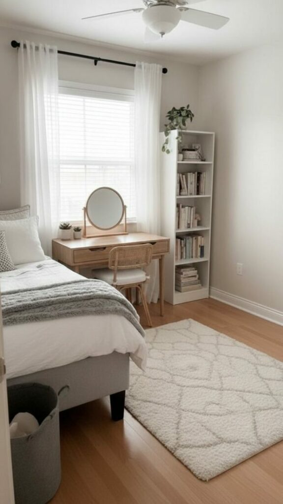
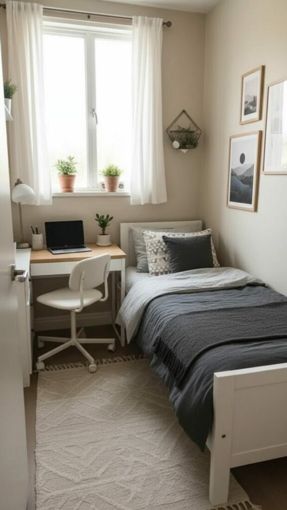
Desk Setup Colors for Focus
Your desk is your cockpit. It is where you work. Dorm room color designs must extend to this zone specifically.
Visual clutter kills focus. If your desk is covered in multi-colored pens and papers, your brain gets tired. You need a system.
Stick to a monochromatic scheme for desk accessories. If your room is blue, get blue pen holders. Get a blue desk mat.
A large desk mat is crucial. It covers the ugly laminate desk surface. It provides a soft place for your wrists. It introduces color right under your nose.
In addition, manage your cables. Black cables look messy against a white wall. Use white cable sleeves. Camouflage the tech.
Storage as Decor
Storage is usually ugly. It is usually clear plastic. However, in a small dorm, storage is visible. It is part of the decor.
Hide the clutter. Use fabric bins. If you have open shelves, use matching baskets. This hides the random colors of your stuff.
If you use plastic drawers, line the front with colored paper. Use scrapbook paper that matches your palette. Tape it to the inside of the drawer front.
This hides the contents. It creates a solid block of color. It turns cheap storage into a design element. It is a simple DIY.
Common Mistakes to Avoid
Even with the best intentions, mistakes happen. Avoid these common traps to ensure your room looks professional.
1. The Matchy-Matchy Trap:
Do not buy a “bed in a bag.” These sets are flat. The pillow matches the sheet which matches the comforter. It looks boring.
Mix your brands. Mix your textures. Buy sheets from one place and a duvet from another. The slight variation in hue adds depth.
2. Ignoring Negative Space:
You do not need to cover every inch of wall. Eyes need to rest. Leave some white space. It allows the colored elements to breathe.
3. Using Retail Packaging:
Soap bottles and snack boxes are designed to grab attention in a store. They are bright and loud. Hide them.
Decant your soap into a plain dispenser. Put your snacks in a basket. Removing labels reduces visual noise significantly.
Seasonal Updates for Your Space
Your dorm room color designs can evolve. You do not need to buy new furniture to change the vibe for the season.
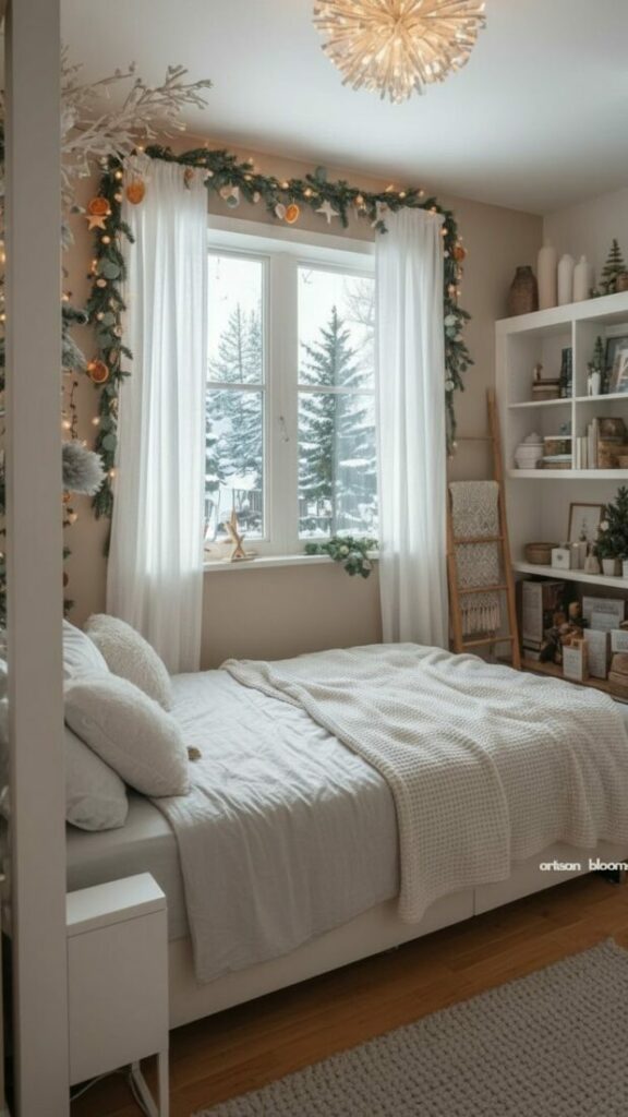
Fall: Add a burnt orange throw blanket. Add a pumpkin-spice scented candle (or a reed diffuser if candles are banned).
Winter: Add more fairy lights. Switch to flannel sheets. Add a thick, faux fur pillow for warmth.
Spring: Switch to fresh flowers. Change your heavy duvet for a lighter quilt. Introduce pastel accents.
These small changes keep the room feeling fresh. They prevent you from getting bored with your surroundings halfway through the semester.
Conclusion: Your Sanctuary Awaits
College is a time of transition. It is chaotic, exciting, and exhausting. Your room needs to be the one constant in your life.
By implementing these dorm room color designs, you are taking control. You are building a sanctuary. You are prioritizing your well-being.
Do not be afraid to experiment. If a color feels wrong, change it. Decor is fluid. It should grow as you grow.
Start with your bedding. Then, fix your lighting. Finally, layer in your personality. You have the tools. Now, go create a space you love.